Ryanair's dark UX patterns persist in 2026 check-in process
By
danosull
Plain bagel done well. Pleasantly substantive.
Summary
Dan O'Sullivan's blog post examines Ryanair's use of dark UX patterns during their summer 2026 check-in process. The author documents 9 stages users must navigate to avoid unwanted upsells and extra payments, highlighting how the airline deliberately makes opting out of insurance and other add-ons confusing. The post references a classic example from 8 years ago where users had to select "Don't Insure Me" from a country list, and shows that these manipulative design practices persist in 2026.
Key quotes
· 4 pulledEveryone likes dark UX patterns – such fun!
Ryanair are Europe's most profitable airline and they are masters of this noble form.
I count 9 stages a user has to successfully navigate to avoid extra payment
Don't be tricked into unlocking c
You might also wanna read


I Tested 5 AI Tools on 10 Real UI Design Prompts — Here’s What Actually Works in 2025
 Prototypr·8mo ago
I Tested 5 AI Tools on 10 Real UI Design Prompts — Here’s What Actually Works in 2025
Prototypr·8mo ago
Career Path Guidance for UX and Product Designers: Decision Trees and Skills Assessment for 2026
This article provides guidance for UX and product designers on shaping their career paths for 2026, featuring decision trees for career plan
 Smashing Magazine·5mo ago
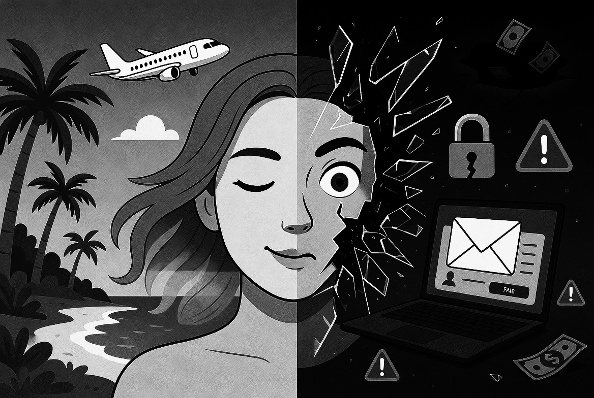
Travel Scams Are Getting More Sophisticated in 2026: What to Know About Fake Booking Sites and AI Phishing
The article warns travelers about increasingly sophisticated travel scams in 2026, including fake intermediary booking sites and AI-generate
 vali.now·1d ago
AI Platform Detects Manipulative Design Patterns Before Interfaces Ship
This article covers an AI platform designed to detect and prevent manipulative design patterns (dark patterns) in user interfaces before the
AI's Impact on UX Design: Blurring Lines Between Design and Engineering
The article examines how the rapid adoption of AI is fundamentally changing the UX design profession, blurring traditional boundaries betwee
Smashing Magazine·1mo ago