Pico CSS: A Minimal, Class-Light CSS Framework for Semantic HTML
By
mpweiher
Sesame, salt, and substance. A flagship bake.
Summary
Pico CSS is a minimal, lightweight CSS framework that styles semantic HTML elements directly with fewer than 10 CSS classes overall. It offers a class-less version for purists, works without dependencies, package managers, external files, or JavaScript, and makes every HTML element responsive and elegant by default. It's designed as a clean starting point for lightweight design systems.
Key quotes
· 3 pulledWith just the right amount of everything, Pico is a great starting point for a clean and lightweight design system.
Thriving on simplicity, Pico directly styles your HTML tags, using fewer than 10 .classes overall.
No extra baggage needed. Pico works seamlessly without dependencies, package managers, external files, or JavaScript, achieving elegant and straightforward styles with pure HTML markup.
You might also wanna read


Introducing Boss-CSS: A Polymorphic CSS-in-JS Library with Multiple Styling Approaches
Boss-CSS is a polymorphic CSS-in-JS library created by a developer to address limitations in existing CSS-in-JS solutions. The library suppo
 dev.to·3mo ago
A Critical Perspective on Tailwind CSS: Why Some Developers Prefer Vanilla CSS
The article is a passionate rant against using Tailwind CSS, arguing that traditional CSS is not difficult to learn and use. The author expr
 fuckyouiwontusetailwind.com·5mo ago
WebSparks: An AI-Powered Tool for Building Web Applications Without Extensive Coding
WebSparks is an AI-powered software engineer that transforms ideas into fully functional web applications without requiring extensive coding
 innovirtuoso.com·23h ago
Joost de Valk publishes open Website Specification: 128 rules for modern, future-proof websites
Joost de Valk, creator of Yoast SEO, published the Website Specification (specification.website) — an open, platform-agnostic reference docu
 ppc.land·1d ago
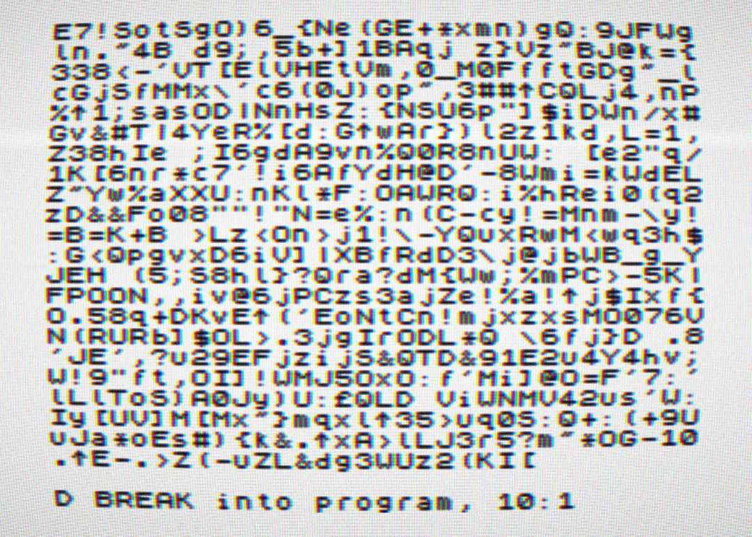
ZX Spectrum BASIC interpreter rebuilt from scratch to run natively in web browsers
A developer has rebuilt the ZX Spectrum's BASIC interpreter from scratch to run in a web browser, without emulating the original Z80 hardwar
 boingboing.net·1d ago
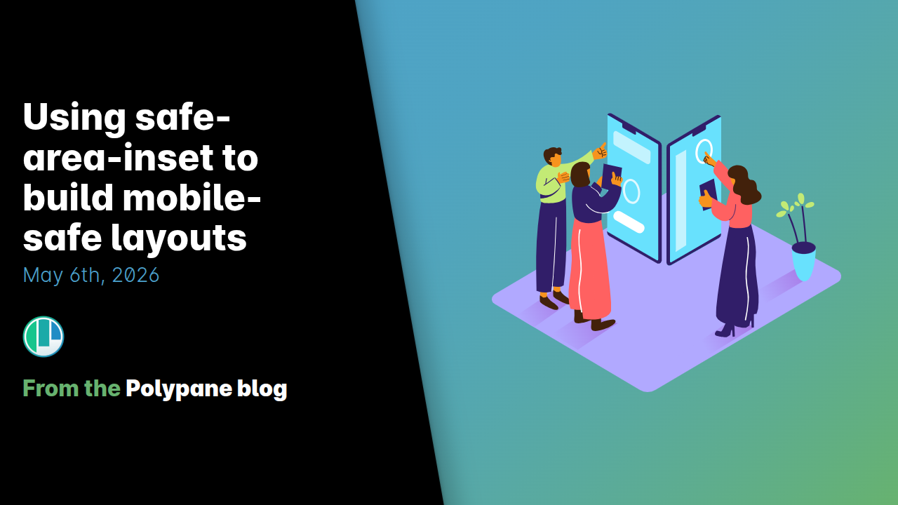
Building mobile-safe layouts with CSS safe-area-inset properties
This article explains how to use CSS safe-area-inset properties to build mobile-friendly layouts that account for non-rectangular screen fea
 polypane.app·1d ago