LINE Launches Its First Proprietary Typeface: LINE Seed
By
totetsu
Plain bagel done well. Pleasantly substantive.
Summary
LINE Seed is LINE's first proprietary typeface designed to embody the brand's identity of convenience and friendliness. The typeface was created to provide a consistent visual language across LINE's ecosystem, with three distinct styles (Regular, Bold, and Light) optimized for digital interfaces. The design focuses on readability, accessibility, and maintaining LINE's brand personality while ensuring technical performance across various platforms and devices.
Key quotes
· 4 pulledLINE Seed is LINE's new typeface that was created based on the brand's convenient usability and friendly identity.
Just like a seed that grows into a plant, LINE Seed will grow with LINE and its users.
The typeface was designed to be highly readable and accessible, with clear character shapes and generous spacing.
LINE Seed comes in three weights: Regular, Bold, and Light, each optimized for different use cases within the LINE ecosystem.
You might also wanna read


Chantelle Pulp and Monotype create a variable font logo that embodies brand identity through shape-shifting typography
Variable fonts have been used primarily for technical efficiency (responsive type, file size benefits), but Chantelle Pulp's collaboration w
 Creative Boom·4mo ago
AI company logos and their unintended anatomical resemblances: A Feedback column
A humorous Feedback column from New Scientist that observes the proliferation of AI company logos and notes a blogger's observation that man
 newscientist.com·5h ago
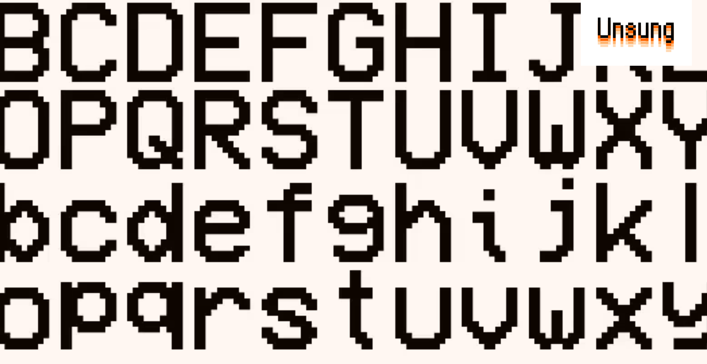
Modern pixel fonts: Analog Mono and Coral Pixels revive retro digital aesthetics
A blog post highlighting interesting modern pixel fonts, focusing on Andrew Gleeson's Analog Mono (which fixes issues with the classic VCR O
 unsung.aresluna.org·6d ago
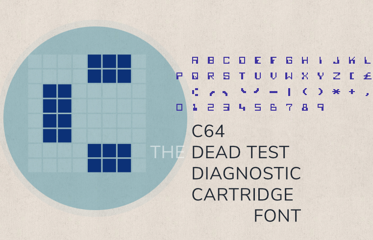
A Technical Deep Dive into the Commodore 64 Dead Test Cartridge Font
A detailed technical exploration of the font used in the Commodore 64's "Dead Test" diagnostic cartridge. The article documents the font's d
 masswerk.at·7d ago
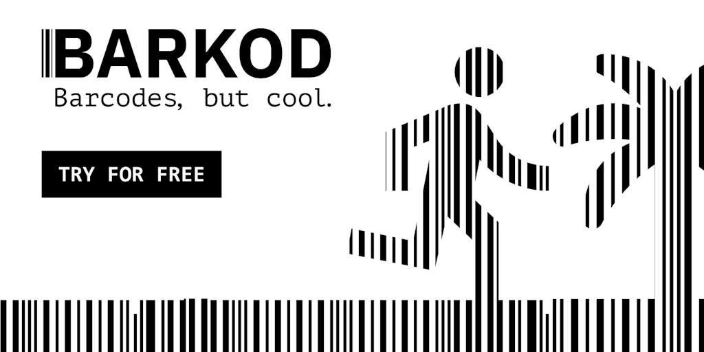
BARKOD Studio: Design Tool for Creating Brand-Aligned, Scan-Ready Barcodes
BARKOD studio is a design tool that transforms standard barcodes into stylized, brand-aligned assets while maintaining scan functionality. I
 Product Hunt·1mo ago
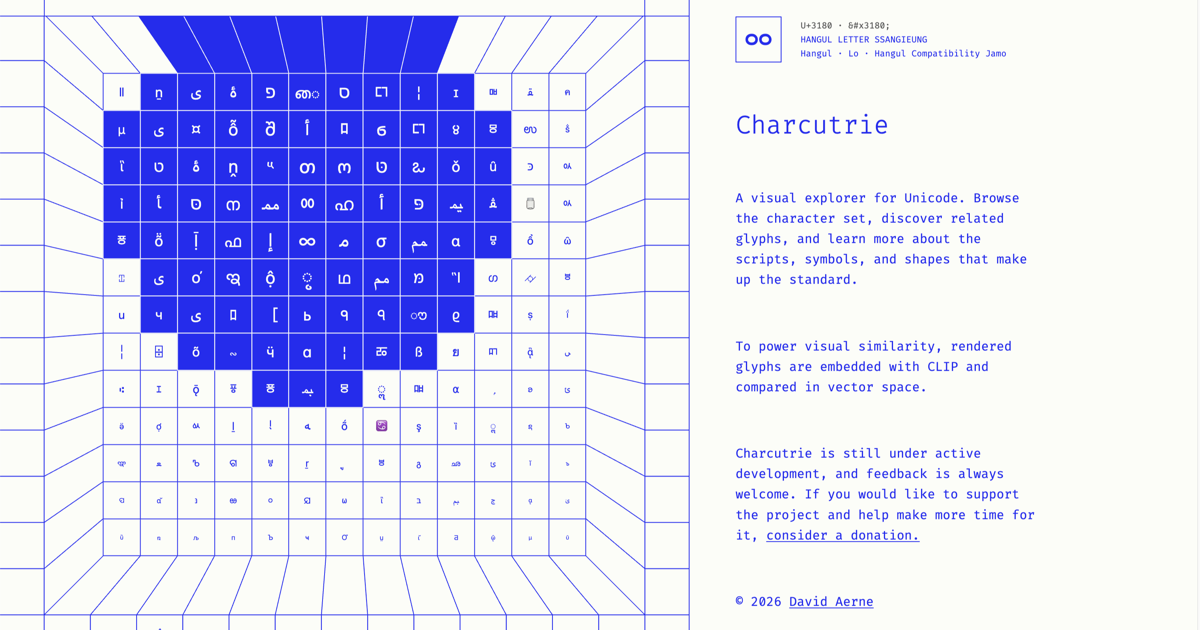
Charcuterie: A Visual Explorer Tool for Unicode Characters and Glyphs
Charcuterie is a visual explorer tool for Unicode that allows users to browse characters, discover related glyphs, and learn about scripts,
 charcuterie.elastiq.ch·1mo ago