Improving Country Selection UX in Web Forms: Moving Beyond Standard Dropdowns
By
dlrush
A snack-sized bagel for a snack-sized appetite.
Summary
This article critiques the standard country dropdown implementation used in web forms, highlighting its limitations including lack of filtering, slow scanning, poor mobile experience, and difficulty in searching. It proposes better alternatives focusing on improved search functionality, intelligent ordering, clear labeling, and better implementation approaches for enhanced user experience in checkout, registration, and shipping forms.
Key quotes
· 5 pulledCountry selection appears in nearly every checkout, registration, and shipping form on the web.
Most implementations still rely on a native HTML select populated with all 195 countries in alphabetical order. That is a defensible default, but not a very good one.
It is slow to scan, hard to search, and especially awkward on mobile.
This post examines where the standard pattern breaks down and outlines a better alternative.
A full country list inside a native select has several structural limitations.
You might also wanna read


The Site-Search Paradox: Why Internal Search Fails and Global Search Engines Succeed
The article examines why internal site search often fails despite advanced technology, while global search engines like Google succeed. It e
 Smashing Magazine·2mo ago
Modern Web Bloat: How Major Publishers Create Frustrating User Experiences
The article critiques the bloated state of modern web pages, using the New York Times as an example where a simple visit to view four headli
 daringfireball.net·2mo ago
Critique of Scroll Fade Animations in Web Design
The article criticizes the overuse of scroll fade animations in web design, arguing that they often create poor user experiences by being ex
 dbushell.com·2mo ago
Streamlining Address Forms: Why ZIP Codes Should Come First to Auto-Fill City, State, and Country
The article criticizes the poor design of online address forms that require users to manually input multiple fields (street, city, state, co

Cloudflare Redesigns Turnstile and Challenge Pages with Focus on Accessibility and User Experience
Cloudflare has redesigned its Turnstile widget and Challenge Pages, which serve 7.6 billion daily challenges across the internet. The redesi
 blog.cloudflare.com·3mo ago
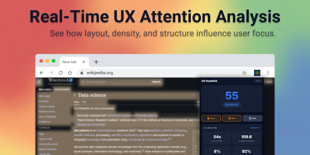
UX HeatGrid Chrome Extension: Real-Time Heatmap Visualization for User Attention and Content Density
UX HeatGrid is a Chrome extension that provides real-time visualization of user attention, content density, and layout balance through grid-
 Product Hunt·3mo ago