HTML-Only Conditional Lazy Loading Using Preload and Media Queries
By
netol
Warm and crisp on the edges. A bagel with a bit of bite.
Summary
The article discusses a technical workaround for conditional lazy loading of images in HTML without server-side device detection or JavaScript. It addresses the challenge that "above the fold" positioning varies by screen size, making it difficult to correctly apply lazy loading to images that might be above the fold on desktop but below on mobile (or vice versa). The proposed solution leverages browser behavior where images won't be delayed if already fetched, using preload with media queries to conditionally load images based on screen size.
Key quotes
· 4 pulledThe accepted practice is to not add lazy-loading to images above the fold, especially the LCP image.
The problem is that 'above the fold' depends on screen size: an image can be above the fold on desktop and below it on mobile.
With native lazy loading and static HTML (e.g., without device detection on the server side or JavaScript), you normally have to pick one behavior and get it wrong for part of your users.
But there's a small workaround that seems to work. Browsers won't delay the loading of an image if it's already been fetched.
You might also wanna read


WebSparks: An AI-Powered Tool for Building Web Applications Without Extensive Coding
WebSparks is an AI-powered software engineer that transforms ideas into fully functional web applications without requiring extensive coding
 innovirtuoso.com·23h ago
Joost de Valk publishes open Website Specification: 128 rules for modern, future-proof websites
Joost de Valk, creator of Yoast SEO, published the Website Specification (specification.website) — an open, platform-agnostic reference docu
 ppc.land·1d ago
ZX Spectrum BASIC interpreter rebuilt from scratch to run natively in web browsers
A developer has rebuilt the ZX Spectrum's BASIC interpreter from scratch to run in a web browser, without emulating the original Z80 hardwar
 boingboing.net·1d ago
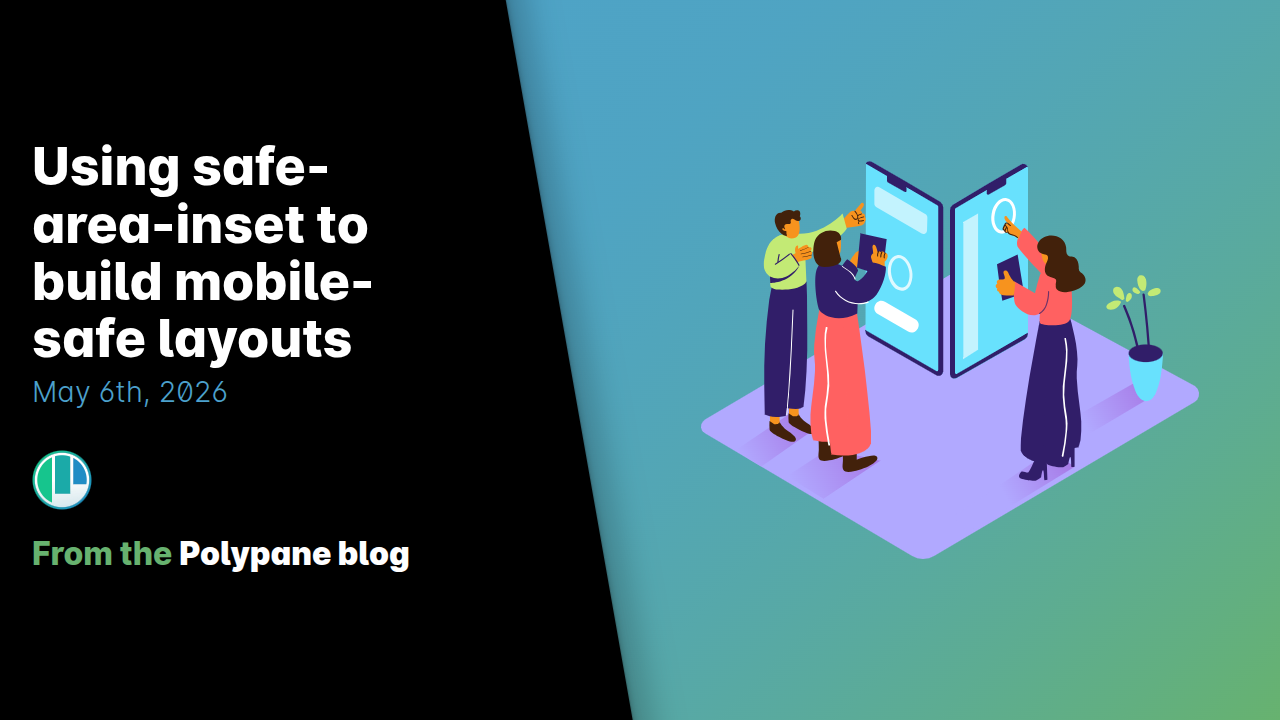
Building mobile-safe layouts with CSS safe-area-inset properties
This article explains how to use CSS safe-area-inset properties to build mobile-friendly layouts that account for non-rectangular screen fea
 polypane.app·1d ago
How to Set Up an Apache Reverse Proxy for an Ecommerce Website
This article provides a comprehensive, start-to-finish guide on setting up an Apache reverse proxy specifically for ecommerce websites. It c
 blog.radwebhosting.com·2d ago
Implementing live text search in React with Firestore Enterprise's built-in search pipeline
Firebase's Firestore Enterprise edition now includes built-in text search support. This article demonstrates how to implement live text sear
 firebase.blog·2d ago