Cracker Barrel Faces Backlash Over Minimalist Logo Redesign
By
Ellen Eberhardt
An everything bagel for the brain. Substantive, layered, well-seasoned.
Summary
Cracker Barrel, the American restaurant chain known for its country-themed dining experience, faced significant online backlash after redesigning its iconic logo. The traditional logo featuring a country salesman and barrel was replaced with a minimalist design consisting of a gold background and lettering. The rebranding effort, rolled out in late August, was met with widespread criticism from customers and social media users who felt the new design lacked the charm and character of the original. The controversy highlights the challenges companies face when updating established brand identities that have strong emotional connections with their customer base.
Key quotes
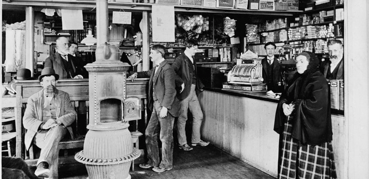
· 3 pulledCracker Barrel has faced online backlash for the redesign of its logo, which until recently featured a country salesman and a barrel
The new logo is now composed of a minimal gold background and lettering
Cracker Barrel rolled out the new logo in late August as part of a larger rebranding effort across the nationwide country-themed chain
You might also wanna read


Cracker Barrel Reverts to Original Logo Following Customer Backlash and Trump Criticism
Cracker Barrel is reverting to its old logo after facing significant customer backlash and criticism from President Trump over a new streaml
Cracker Barrel Logo Redesign Sparks Internet Controversy in Culture Wars
The article discusses the controversy surrounding Cracker Barrel's logo redesign, which has sparked internet outrage as part of the ongoing
Cracker Barrel Logo Redesign Sparks Cultural Debate About Corporate Branding Trends
The article discusses the national uproar over Cracker Barrel's logo redesign from its traditional, old-timey branding to a more modern, cor
 unpopularfront.news·8mo ago
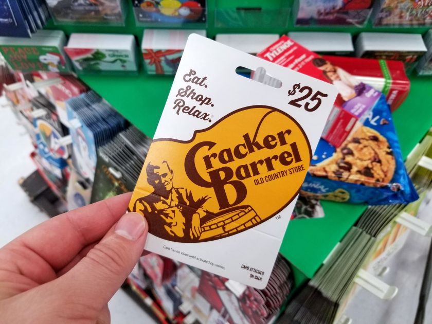
Cracker Barrel's rebrand cost $100M-$200M in stock value — a lesson in brand equity
Cracker Barrel's rebranding effort caused a $100M-$200M drop in its stock value immediately after the new brand was revealed. While widely s
 Creative Boom·6mo ago